SITE-WIDE REDESIGN
Research / Design Systems / Responsive designs
Overview
The Brief:
Eldorado Gold is a gold and base metals producer with mining, development and exploration. They want to update their website to modernize their branding and stand out against competitors.
Role:
Lead UX/UI Designer
The Process
01: Discovery & Mood Boards
First I lead a Q&A style stakeholder workshop to further understand their frustrations with their old website. They wanted to incorporate their brand colors in a sophisticated but bold way. I proposed the two concept options below and the client ended up wanting to combine aspects of each concept.
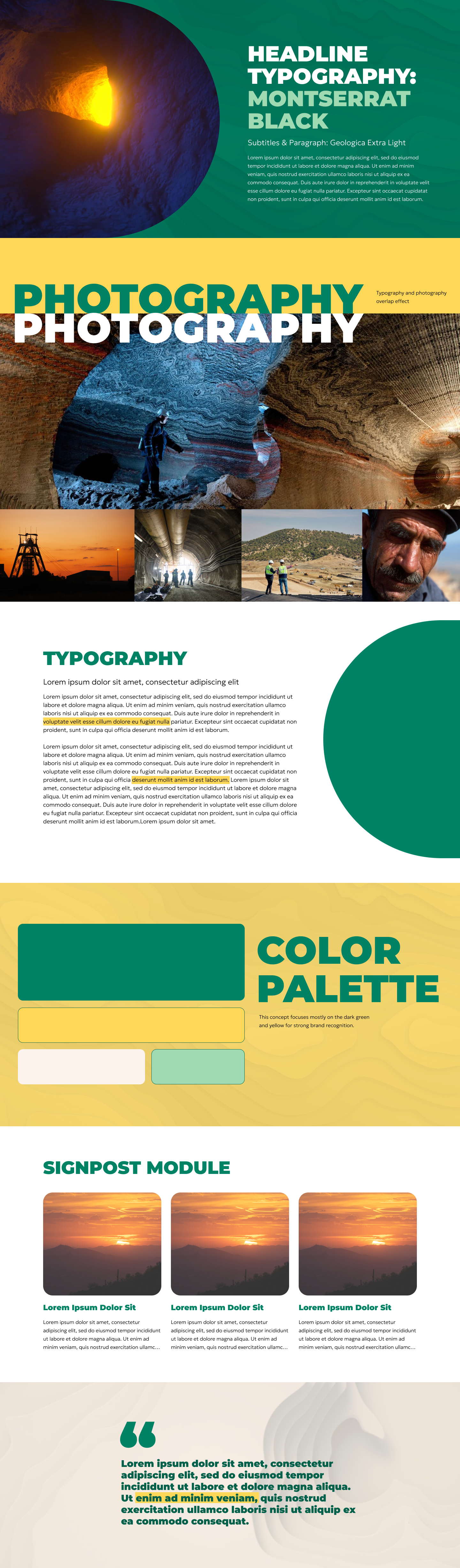
Strong
This concept explores a more literal translation of their brand guidelines. I use their two primary colors heavily and enforce bold typography to drive strong brand recognition. Bold photography of the caves and workers position eldorado gold as the explorer archetype.
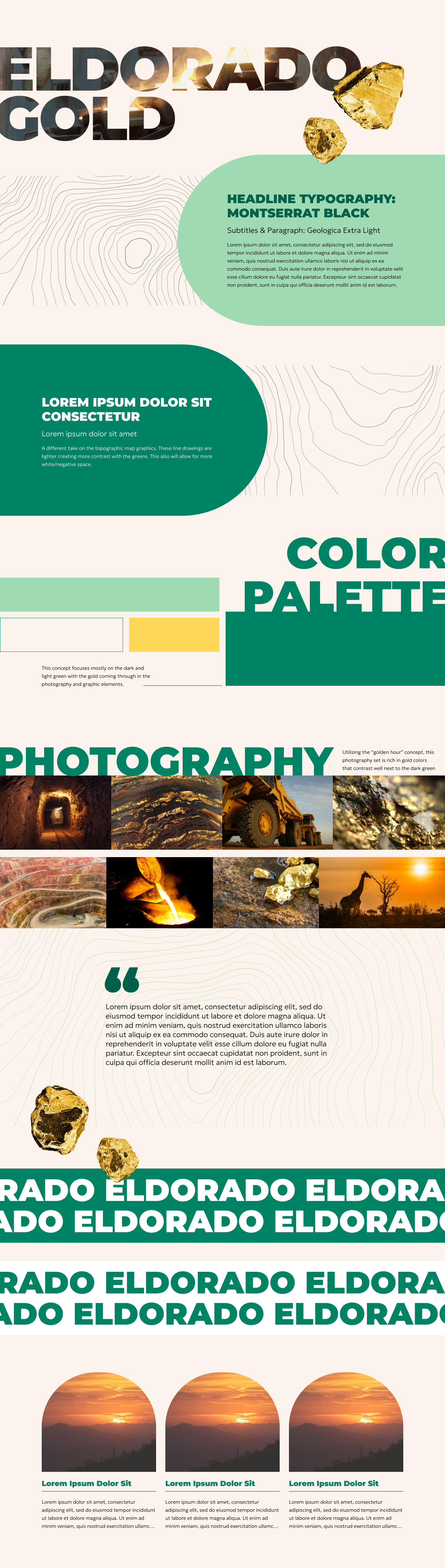
Sunset
This concept explores a light, clean and modern translation of their brand. I created line versions of their topographic map graphics for texture and over lapped elements for dimension to keep the user engaged. I also used images with lots of yellows and oranges in them to replace the need to use their primary yellow. This avoids any accessibility issues they may come across with the use of that color.
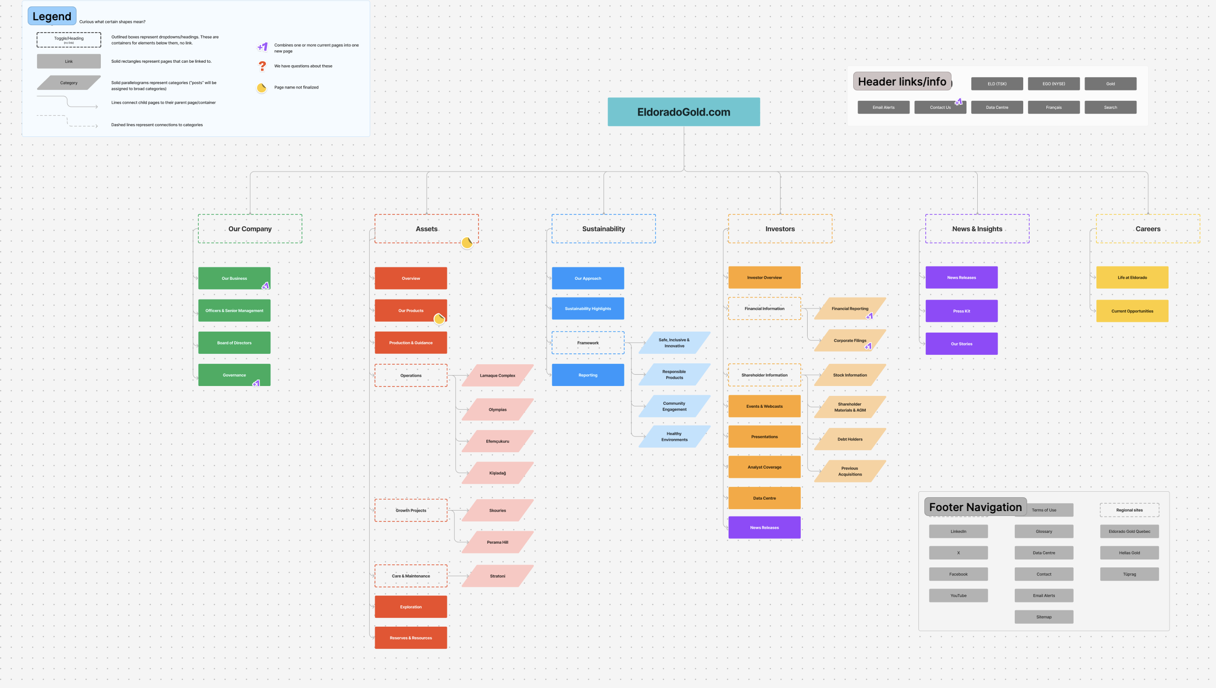
02: sitemap
We reorganized their main navigation to simplify the user journey and get users to their destination in fewer clicks.
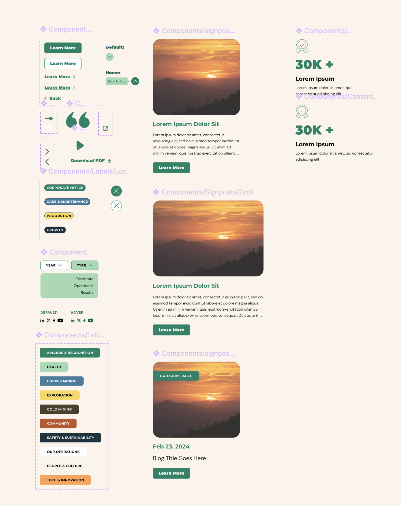
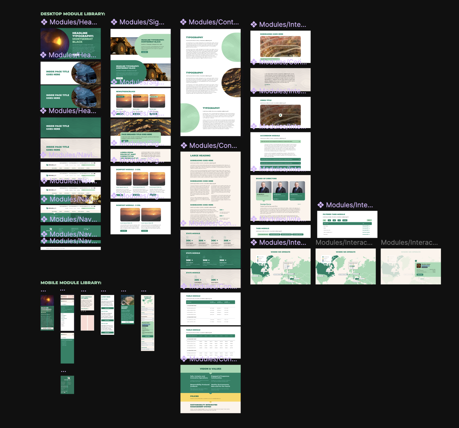
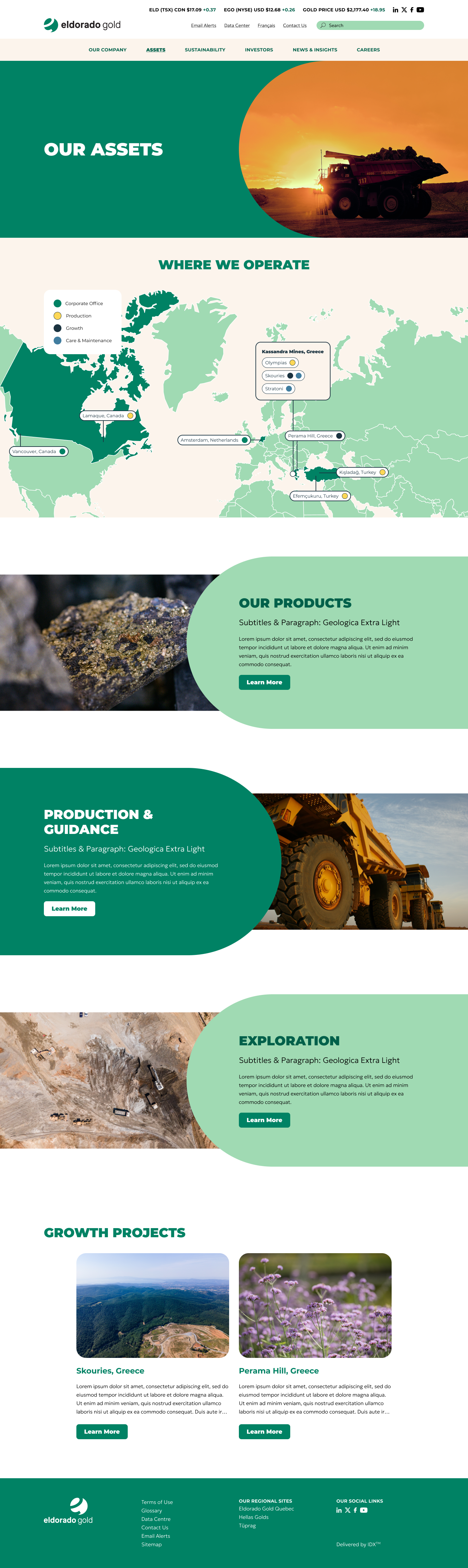
03: Design
I developed a design system that marries both concepts without “over-designing”. In total I designed 30+ pages in figma. Here are a select few screens:


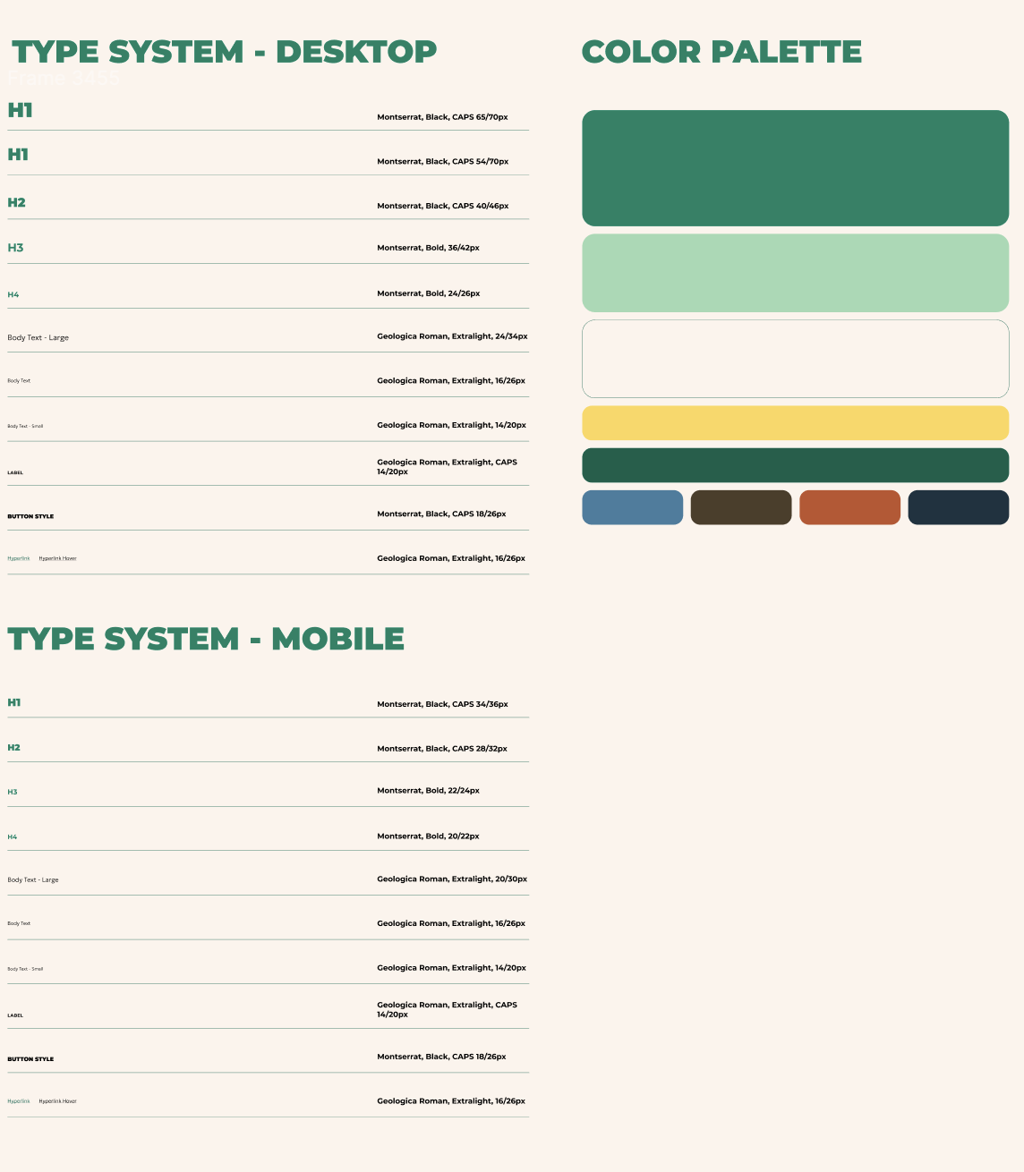
04: Design System